INTRODUCTION
Ambient and decorative lighting consists of the following characteristics that can be utilized differently in different spaces (e.g. retail space, office space, residential space, warehouse space, etcetera.)
1. Brightness & Contrast
2. Light Color
3. Color Rendering
4. Uniformity
The following article gives a brief explanation of these qualities and their application as well as a few examples of how they may apply in real-world settings.
BRIGHTNESS
This attribute of light quality is often the most obvious: building occupants intuitively know when a space is bright or dark. (Light designers quantify brightness in a unit of measure called a lumen. Foot candle is another unit of measure for brightness and is just the average number of lumens per square foot in a given space.) Any light source can increase the brightness of a space by increasing the sources power. LED offers the opportunity to increase the brightness of a space at a lower energy consumption than other sources. On a one-for-one brightness comparison, LED uses about half of the energy as the next most efficient light source and up to an eighth of other common used sources.
CONTRAST
Contrast is actually a part of brightness. For the sake of this article, contrast is the difference in brightness across different dimensions of the object being lit. For example, an object lit from the side (such as a tree from a setting sun) will be brighter one side than on the other. Similarly, a box lit from a purely overhead light source will be brighter on its top than on its sides and its bottom. Some contrast is required for many fine motor tasks such as inspecting finish quality and executing fine fabrication work by hand. Too much light from all directions can create a no-contrast scenario and objects will appear “washed out.” This will make it much more challenging to visually identify material blemishes such as scratches as well as execute fine motor skills. Contrast is typically only important to consider in these applications.
LIGHT COLOR
LED light can come in almost any color. For the purpose of this article we will focus on the spectrum below. The numbers listed are in Kelvin, another unit for temperature (similar to Celsius or Fahrenheit). The full technical explanation is more involved, but it’s sufficient to say that the light color scale is analogous to a flame: the higher the temperature the flame / light; the whiter its appearance.

Most artificial light sources exist between 2200K and 6000K. Older incandescent, filament bulbs produce a light closer to the yellow-orange of 2200K. Newer technologies can produce light anywhere fr om 2200K to 6500K. Natural light from day-time sun in a cloudless sky exists between 5500K and 6500K. Light color in t
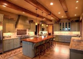
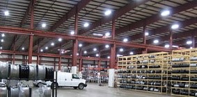
 he range of 2200K – 3000K provides a relaxing, welcoming environment environment. For this reason these light temperatures are sometimes referred to as “warmer” which can be confusing since they are on the lower end of the temperature scale. This temperature range is not good to promote occupant alertness and detail rendering. Warmer lights sources are good for retail, restaurant, residential, and other applications. Temperatures in the range of 4000K – 6500K are known to enhance occupant alertness (likely as a result of their closer similarity to natural daylight) and better render fine details. The eye actually perceives light in this range to be brighter than equally powered warm light sources. Again in what can sometimes be a confusing lighting jargon, this light color range is often described as cooler. Cooler light is good for warehouses, office spaces, manufacturing sites, and many other commercial lighting applications.
COLOR RENDERING
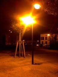
Color rendering can quickly become a very technical conversation for lighting experts, but, for purposes of this article, color rendering will be described as how well a light source displays color compared to natural daylight. Under natural light it is very easy to differentiate one color from the next. In short, natural daylight renders colors very well. A 0 – 100 Color Rendering Index (CRI) is used to describe how well a light source displays color in comparison to natural light (with 100 matching natural light). Some older light sources such as sodium vapor render color very poorly (CRI less than 50). Many older outdoor light fixtures used sodium vapor and under its illumination it can be difficult to distinguish between different colors as everything becomes awash in an orangish tint.
All standard, modern lighting technologies have adequate color rendering for most commercial applications (70 – 80 CRI). A few applications, namely retail, benefit from high CRI (>90) light sources. Halogen, Fluorescent, and LED all can provide this high level of color rendering, but it’s important to note that the “standard” versions of these sources do not. Rather the high CRI versions of a halogen, fluorescent, or LED light source must be identified and specified. It’s also worth noting LED can provide this high level of color rendering with the least amount of energy use (with LED using half of modern fluorescent and approximately one fifth of that of halogen).
UNIFORMITY
Uniformity applies to all of the above light quality characteristics. It describes how evenly these characteristics exist across a given space. It is most generally encountered in considering the brightness and lighting color for a space. In some applications, its required to have good uniformity in lighting quality characteristics. In others, it is not. For example, very high levels of brightness are not needed throughout a hotel hall. For most of the length of the hall, enough light for a person to safely navigate is sufficient. More light may be needed near the door in order for that person to be able to perform finer detail tasks of handling keys, unlocking doors, and entering the room. In this case, a light source near the door(s) can be brighter than the light sources elsewhere in the hallway. In another example, an office may be generally lit by overhead lights to a certain level of brightness, while desk-top lamps (i.e. task lighting) provide increased brightness for the fine motor work functions (e.g. typing, writing, operating a phone, etcetera). Fabrication and certain types of manufacturing may benefit from a task lighting approach as well. However, other types of manufacturing such as those where inspected or fabricated parts move frequently (such as on an assembly line) may require a more general, high level of lighting. Trying to utilize task lighting would be too difficult as the work objects are constantly or frequently in motion.
Light color temperature is another important characteristic to which uniformity applies. Having different light color temperatures (e.g. 2700K, 3500K, 5000K, etc) throughout a space will generally not hinder the performance of that space. However, cosmetically it can be very un-appealing.
FLICKER & GLARE
Flicker  and glare aren’t inherit characteristics of a light source but rather of that source’s design into a fixture or that fixture’s design into a space. Flicker occurs when the light rapidly turns off and on as a result of faulty internal electronic hardware or faulty building circuitry. This type of flicker is recognized and is an annoyance to all occupants of a space. In older lights (particularly fluorescent), flicker could also occur at a much faster rate as a natural characteristic of the light source. This flicker is so fast (50 – 60 times per second) that only some people are sensitive to it. What’s important to note about this type of flicker is that even though many people won’t and can’t notice it, some people do and are adversely affected by it (blurred vision, headache, general unease, and more). LED lights can be prone to flicker when an improper/poor quality bulb or fixture is selected, an improper dimming switch is utilized, or an internal issueoccurs with the LED light’s driver.
Glare can occur with any light source when it outputs light too brightly and the eyes do not have time to adjust. The most common experience of glare is when another automobile approaches with its high beams headlights on. The eyes do not have time to adjust to that level of brightness and the vision is blurred until the stare is averted or the car passes. There are several ways to address glare in a building setting and it can easily be overcome by a good fixture design as well as a thoughtful lighting layout. Glare is like flicker in that some people are more sensitive and adversely affected by a certain level of glare than others.
SUMMARY
Usually at least one of these light characeristics is important to keep in mind when executing a light design, specification, or retrofit. In some applications, several will be important. Some of the quantitative metrics described in this article (e.g. foot candles, CRI, color temperature) can be used to help narrow in on the best lighting sources for a given application. ENLIGHTEN has both the tools and knowledge to estimate the light quality characteristics across a space. See other ENLIGHTEN blog articles for more on the importance of light estimations.
Beyond quantitative engineering metrics, many light characteristics are subjectively perceived slightly differently from one viewer to the next in a real-world application. Therefore, if possible, it is beneficial for a client to view their potential lights in a real-world application. ENLIGHTEN has a sample process to help clients do just that.
Enlighten is lighting consultant, designer, and wholesaler for commercial and industrial spaces.

